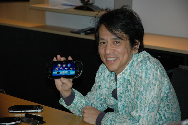
Last December I attended the Tokyo launch of PlayStation Vita, which is going to be in your hands just about one month from now. While I was there I got to chat with Tokashi Sogabe of the Sony Corporate Design Centre, head of the team in charge of the aesthetic of the console. Sogabe-san has 27 years of experience working with Sony, in which time he has designed the Walkman, Vaio notebooks, the current slimmer model of PS3 and many other electronic
devices.

We spoke about the look and feel of PS Vita and the eternal tug of war that goes on between the designers wanting to create something as sleek and compact as possible and the engineers whose job it is to cram as much technology as they can into that shell.
PS.Blog: A lot of people seem impressed by the five inch OLED screen on PlayStation Vita. How did you decide on that particular size?
Tokashi Sogabe: When we first saw a prototype of the beautiful OLED screen we used on PS Vita, we felt it deserved to be bigger than the 4.3 inch screen on PSP. It’s almost as if we settled on five inches in order to really maximise the same impact that we felt when we first saw it.
It is easy to fall into the trap of thinking bigger is better when it comes to screen size but it isn’t. There was a great deal of discussion and we even talked about using a 5.5 inch screen with all of the buttons included on it, but that had a negative impact on the operability of the device and the idea was abandoned.

How much development has gone into the dual analog sticks and what design challenges did they present?
The engineers have been working on the PS Vita analog sticks for quite some time and it is a much greater technical challenge to build sticks this small than you might imagine. We also built a prototype with flat slide pads, a bit like what you have on your laptop, but it just didn’t feel responsive enough for gaming and we learned that you need that physical response of tilting the stick to feel like you have total control.
For me as a designer they have presented a huge challenge, partly because it much easier to design products with entirely flat surfaces. We also discussed the position of the analog sticks at great length: I didn’t feel that they were in the perfect position from a design perspective but Worldwide Studios were adamant that they were in the best position for comfortable gameplay, and in the end they won out on that point.

How do designers and engineers work together to ensure all aspects of the device, such as performance, form and comfort of use are all just right?
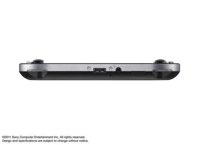
There is always a battle between engineers and designers and I’m not just talking about PlayStation Vita when I say that – it is always there. To give you an example, I originally intended for the final machine to be thinner than it is now. From a designer’s point of view thinner is always better. However, the engineer has to cram all of the technology into that case and so they’re going to be fighting back on that point.
A designer is always looking to create that magical first impression aesthetically and an engineer’s job to bring the working device into reality; neither side wants to make any compromise whatsoever.
Also, it’s not just designers and engineers who have a say. When we started work on PS Vita, the shape we had in mind was very similar to the final product, but in the testing phase we tried many different designs, including a sliding system [similar to PSP go] and a clamshell. We settled on the final model after many discussions with the game development teams in Worldwide Studios.
Who usually wins these battles between designers and engineers?
Many years ago I would have said that it was the designers, at least here at Sony. In fact, when we were developing the Walkman I remember coming to the office with a block of wood and saying that it needed to be this size and shape, and it was up to the engineers to make that happen.
It’s hard to compare then and now because Sony has become so much bigger as a company. Of course, your question also depends on personalities – some designers are very stubborn and will never budge, whereas others are easier to convince.
Talking about PS Vita specifically, I was pushing through this idea of ‘thinner is better’ but I had to be reminded of things like the feature set, processing power, battery life… the overall package.
There are times when you have a design idea that you love but then the engineers see a major flaw straight away. I actually wanted PS Vita to be entirely made of metal but then it was pointed out that this was impossible due to the internal Wi/Fi, 3G and GPRS antennae.
So yes, I’m afraid designers do lose on some occasions!
Related Posts:
- Mortal Kombat Getting Touchscreen Fatalities for Its PlayStation Vita Version - kotaku
- Mortal Kombat for PS Vita: Ed Boon Talks Touchscreen Fatalities, New Challenge Tower - playstationblog
- Flickr App for the Vita Ready for Your Photos - kotaku
